Tuesday, November 24, 2009

Symbols of Commitment

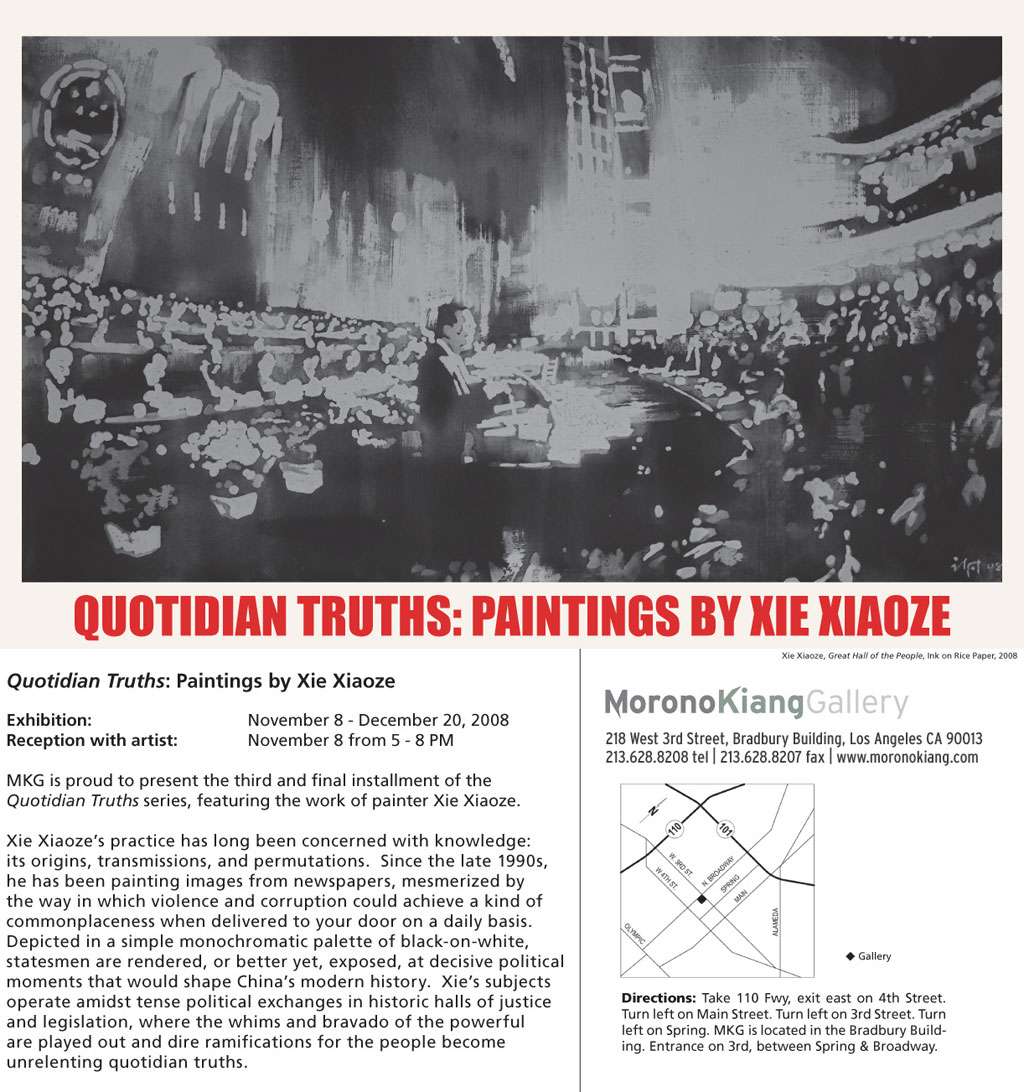
THE TRAIL OF DEATH FOR THOSE WEARING HIGH HEELS

It's been a month and a half since our good friend, Jane Hyun, took the matrimonial leap. The groom (Ethan Emmet Bodle) seemed to be one of sufficient faculties and his family was a reassuring mixture of characters, categoricals and the usual wedding suspects. The ceremony was short and sweet, complete with unexpected pauses and touching vows. The typical ceremonial protocols were followed with the requisite coterie of relatives and friends in attendance and the reception was wonderfully satisfying. Unfortunately, I could not gain audience with the feted couple so I was not able to suss out courtship details or gain enough information on the newly crowned husband to make any snap judgements. I did find the event significant in its organization and as to how it was orchestrated including the specific elements that were chosen to authenticate and give meaning to the ceremony.


A NICE TOUCH FOR A BEAUTIFUL BACKDROP

The wedding took place at the Malibu Nature Preserve, essentially a private campsite for spiritually inclined nature fiends. Choosing this location is a big break from the usual chapel or wedding hall. Weddings today range from humble, small gatherings to full blown extravaganzas that include every cliche and convention imaginable. The outdoor setting displays a commitment to create a truly memorable day and illustrates the lengths the couple are willing to go in order to cement their bond.

GUESTS COMPLETING THE TEST TREK OF FRIENDSHIP

The ceremony was short and sweet with slight variations of traditional ceremonies. Since it was outdoors, the chamber trio had to compete with nature's ambient symphony of breezes rustling the leaves and birds chirping. The small clearing that was the setting was sort of a natural amphitheater with sycamores standing in for an altar. This setting gave the event an intimate feel, allowing the guests to become a party to the contract between the happy couple.

THE MOTHER OF THE BRIDE

I consider myself fortunate to be a friend of the bride's family. I hope that gives me license to reveal that the bride's parents are originally from Korea, from exceptional lineages that can be traced back countless generations. The mother and father have made a commitment of their own in creating a place for their family here in the U.S. They may seem to be conservative scholars, but they are in fact rebellious pioneers in the eyes of their ancestors. Jane reflects that manifest spirit in this wedding ceremony. This does little to mitigate her parent's desire for her to assume an image of domestic normalcy with familial intentions included.

ESCORTING THE BRIDE UP THE PATH

The reception after the ceremony followed the usual blueprint. Drinks with a light nosh before the musical chairs with name cards at round tables with many place settings and too few heating thingies to ward off the coastal temperature drop as the sun coolly set over the horizon (whew!). This apparent nod to tradition was tempered by the beautifully decorated patio... origami cranes by the oodles and home grown succulents acting as centerpieces. The wedding cake did not define the mores and standards of the newly married as their was no cake. An orgy of handcrafted cupcakes arranged in concentric tiers showed the creativity and free spirits of the planners. The ceremonial first slice became the ceremonial unwrapping without the gratuitous face smearing.


MEASURING THE DISTANCE TO THE EXIT?

The whole affair was sweet and romantic. I found the break from tradition a relief from the usual procession of rituals. Most notably, I remember large portions of the day. I usually forget details quickly and I am happy if I can at least remember having been somewhere at sometime. What made the event memorable for me was not the elemental requisite pieces but the details that filled those moments. The cast of characters (which included us, the audience) was a tapestry that filled the spaces in between and provided a stage for the whole procession. I was both inside and outside of the moments making up this day. Very few of these types of affairs affect me in any deep manner, but I found this day to be one of the nicest. It was entertaining and more importantly, personally reassuring. Not in the "its nice to see a young couple get hitched" or "they look so good together" kind of way. I found it reassuring in that it reaffirmed my own personal commitment those many years ago. It reinforced my belief that a personally crafted ceremony is vastly more significant than any cookie-cutter or insane super spectacular side show wedding. It also brings to mind that in creating a unique event involves its own level of commitment. Breaking with tradition while creating a personal expression played out in front of a crowd of a hundred guests is an acid test that will only be the first in a succession of similar trials as a dedicated couple. I wish Jane and Ethan all the best and I thank them for extending a personal invitation for my wife and I to share in their moment.


TWENTY THREE YEARS AND JUST GETTING STARTED


Tuesday, March 24, 2009

Perpetual Mootness

In her article for Edutopia.org (http://www.edutopia.org/arts-music-curriculum-child-development), Fran Smith lays out familiar points in favor of arts education such as early exposure to the arts and governmental policies recognizing the value of arts. The decline of art programs as part of school curriculum is noted with the added caution of the difficulties encountered when these programs are reintroduced. Ann Hulbert points out that the arts do not offer quantifiable results in overall school performance in her article, Drawing Lessons (http://www.nytimes.com/2008/04/27/magazine/27wwln-lede-t.html). She cites statistics and studies to illustrate the fuzzy logic of art education supporters and their claims of success and the reality of clinical investigations that continually show little connection between art and testing success.

The Edutopia article by Fran Smith is an example of the confidence the pro-art education faction has in their beliefs. The Rand Corporation is cited as a supporting authority, as well as other other studies and evaluations. The difference between the two articles lies in the mechanics of the investigations and their results. Ms. Smith takes the academic approach in defining her case by presenting articles, quotes and positive results in classroom examples. The Hulbert article cites clinical examinations by professionals working within the scientific method. The facts and opinions in Drawing Lessons can hardly be disputed without resulting in fingers wagging and desperate appeals

The methodical, double blind placebo examinations cannot be easily disregarded. I must argue that the scientific process can only be superficially applied to art and art education. The success that comes from an early education enhanced by exposure to the arts does not neatly fit onto a Scantron sheet. Studies and opinions can be cultivated to support any side of an argument. This is learned early by any who want to add authority to their opinion. The discussion between the two articles will never find common ground since they are not two sides of the same coin. Since art education is, conceptually, a fluid condition in terms of knowledge acquisition, the level of integration and expression is as different as every pupil in a class is from each other. The Smith article reflects the opinions of many in the arts and simply reinforces popular beliefs. A serious obstacle to dissuading believers, and I am in this group, is the observational and experiential evidence we have witnessed. We know what we know because we have seen what we’ve seen. Not a very good argument in logical terms but strong enough to plant the feet of many art educators against naysayers and bean counters.

Wednesday, March 11, 2009

Laotian Design Studio Project


The iconic image of a clown has much more meaning today than it did fifty years ago. The perpetual smile and entertaining antics of the old Barnum & Bailey Circus performer has been adopted by the counter culture and it has become the poster boy for latent maliciousness that runs deeper than basic childhood delinquency. The clown with a painted face can be traced to the masked tricksters from Greek tragedies. This mythic character is, at times, the outspoken voice of reason in the face of hubristic endeavors. This character has also come to be viewed, in the Western European tradition, as a representation of everyman as he puts on an outward appearance of happiness to hide the sorrow within his soul.

         I chose this particular image of a maniacal clown from the characters created by my younger son. He is keenly interested in comics and all their manifestations from the Sunday Funny Pages to Miyazaki’s anime masterpieces. This version is a portly acrobatic performer seen at the moment of springing off a ball towards the viewer. The voluptuous contours are played against the ragged regularity of the decorative leaf pattern that demarks the margin. The contrast between the two major elements is also marked by their historical and cultural differences. The pattern is an interpretation of traditional vegetative and floral designs from Laos. These types of graphic representations have symbolic and historic connotations often used to decorate official buildings and temples. There is iconographical meanings attached to the patterns but these have been largely usurped in this image by the decorative alignment and intentional somber colors. The predominant culture exemplified in this splash page is the current comic style of appropriation and redirection.

            The clown in graphic comic terms is often a malevolent misanthrope intent on inflicting some heinous scheme upon a particular victim. The perpetual smile is as much a mask as Batman’s cowl or Clark Kent’s glasses. The makeup provides anonymity and with it the luxury of implementing the necessary steps to carry out his intended crimes, but comics are morality plays and this means that this chubby jester will see some form of justice eventually- this is built into the Joey (comic)/Auguste culture. The duality of funny/evil is echoed by those of good guy/bad guy and crime/punishment.

            The colors of the solitary figure are the most clean and bold of the illustration. Primary and secondary colors are traditionally associated with “happy” clowns in the west and in this case they add to the mask that this character hides behind. The background and pattern colors are muted complements following examples from 19th century circus posters. These were printed before process colors or inks were developed and subsequently have a strong neutral cast to them. The integration of the Laotian design parallels the similar appropriation of traditional European patterns common in advertisings and posters in the early days of commercial printing. The variegated leaf pattern was altered and inserted behind the figure and the ball to add a threatening element as well as to add visual depth. The drawing and color application followed the old style of hand compositing used before computers made their generic impact on illustrating. This piece would have qualified as a color trial for a character study and would be refined by reworking the image with more appropriate techniques, specifically pen and ink to give it a smoother look that would afford greater visual impact.

            The colors are meant to suggest an impending nightfall with glow of the afternoon reluctantly ebbing. Comic book evildoers often commit wicked deeds in the dark of night because just as it not only hides their actions it adds to the malevolent aura attached to their position. This clown is displayed with only allusions to evil. It is suggested through his expression, positioning and tools of the trade. It only hints at the badness that may come later and that badness may be very grave. Lon Chaney, familiar with the value of makeup and the advantages of playing the fool to achieve his goals, is credited with saying, “there is nothing funny about a clown in the moonlight.”

Tuesday, March 3, 2009

Yes, I Will Have Another Piece of Humble Pie Please

My Studio Problems is presenting some frustrating problems and these are dredging up some horrific elementary school memories I hoped to have suppressed. One issue is the number of class exercises that I cannot organize and pick off with any success, but it seems as if many others in the class are in the same boat of confusion as myself. 

                                             "C" level work.
                                            My hearts before I screw them up.

There is a critical element that confounds and proves unavoidable, the crappy construction paper and awful art materials that have to be used to create these treasures. The concepts behind these lessons are vital to create effective and cohesive art lesson plans but using these materials and rediscovering their woeful inadequacies reminds me of my earliest school projects. 
I remember hating art projects to the point where I would do them as quickly as possible, or find some alternate way to do the assignment. This would lead to praise from the teachers and getting my ass kicked at recess. I never took art after the sixth grade, drawing only for myself until I stumbled into an art class in college.
Intentions aside, there are alternatives to the materials presented in formative school years. My wife receives supplies from parent groups and uses a portion of her alotted budget for materials that can endure mistakes and efforts to correct them. It is necessary for the motivated instructor to reach out to groups, associations, the district office or whoever has the good stuff.
Meanwhile I return to my sad little efforts. Maybe I can iron them or lay some sizing on before using watercolor. Its more likely that I will use some substitution to regain some control.

Saturday, February 21, 2009

Formal Jargon, Three Examples

Empire of Light 19" x 96"Empire of Light, oil on panel.

                Frederic Stern Gallery has just received new paintings from local artist, James David Thomas. Mr. Thomas has crafted his views on the southland’s vistas for over two decades. He enjoys discussing modernism and its relevance and applications but the current paintings reveal a postmod approach to the familiar landscape.

                Cinematic references are common although the phrases do not reflect their use so much as the effect. High Gain depicts the Hollywood sign in the hazy gloam of the coming Los Angeles evening. The title suggests a brilliant level of detail that simply cannot be found in this slice of LA. The accurate emotional quotient that fills the canvas is captured with intimate accuracy. This is the onset of night in Tinseltown through the eyes of a local. High Gain is not an exercise in visual fidelity, it is an experiential scene, organized by the layers of glazes that simultaneously define and obscure. It has more to do with Impressionism than true modernism if it weren’t for that skilled application of paint.

August Beach 23 1/2High Gain #10, oil and gold leaf on canvas.

Perimeter also misleads the viewer that attempts to see the details from the outside looking in. The title is not so much a literal descriptor as it is an emotional stance, a moment of reflection- as in belly button gazing, not an exercise in light and interplay. This painting is a Formalist’s gold mine. The buildup of layers, diffused spatter and subtle wood grain bleeding through can be used to perpetuate the artist as craftsman of physical theatricality as painting but this little jewel is a soulful search for identity. The viewer is placed on the outside and the act of looking puts him in the position of a nonparticipant. This manipulation is done with a wink and a reference to “I know you know that I know…” Self-referential through and through this one is youngling.

August Beach 23 1/2
Perimeter, oil on panel.

                    Empire of Light is not an homage to Magritte as it is a celebration of Los Angeles’ built in theatricality. LA is the capital of artifice; surrealism is reality on our cultural island. Individuals reinvent themselves here, royalty has nothing to do with inherited titles, rather it’s the size of the contract or number of copies sold that bestows title. Appearance over substance rules the basin and the aura emanating from all that adoration is displayed on a panel wider than WideScreen. The image within the painting goes beyond naturalism in the way it skews at an angle like an opening shot to a movie. But it is LA just the same. Our LA with its stage-like arrangement complete with opening night kliegs.

                    There are other images by Thomas at the gallery but I always hone in on the nocturnes and night views as they speak about an alternate existence within our area. The business of entertainment through the production of theatrical myths is an economical reality but the concept of fame and familiarity, real and unreal, stunts or special effects also has a powerful presence here. This artist conveys these concepts in his compositions. Calling them naturalistic or romantic is too superficial; these pieces illustrate a multifaceted image of Los Angeles. They describe the multi-faceted town of make believe we inhabit. 

Tuesday, February 10, 2009

Corita Kent for Class

            Our Studio Problems class was commandeered last night to create hanging banners to accompany the upcoming show at the CSUN gallery, Passion for the Possible: The Work of Sister Corita. Despite my most earnest intentions to be glum I had a good time struggling to realize an image that reflected the spirit and intent of the artist while trying to complete it in two hours. I was fortunate to be teamed with Jahaira Duarte and Ashley Barriga, both of them Graphic Design majors who worked out the type and the general composition.

            I am so ever jaded to the experience of painting as an expressive medium for myself but it turned out to be revelatory and reassuring in the way the project illustrated the mechanical underpinnings of Corita Kent’s aphorisms as art imagery. That I was still able to lay paint following the sign painting experience from my early days of art ed provided some sense of comfort.


            The banners will be installed on the exterior of the gallery wall in the next couple days. I have a printmaking class at HOLA (http://heartofla.org/ ) this Saturday (10:30 – 12:30), after that I’ll be dashing up to Northridge for the opening and screen printing session.


Friday, January 16, 2009

Youth and Enthusiasm

            One of the forces driving our local art scene today is the energy of the artist youth population. Previous generations in LA followed the way of the lone wolf. As soon as wisdom was gained, the intrepid artist would seek his own path, establish a lair and attempt to find the ultimate answer, or at least a steady paycheck, through artistic production. Sometimes the artist would create a personal ashram and impart his hard won wisdom to followers attempting to set themselves up to seek their own path in the future. This was the American Way of Art. Developed after the examples laid down by Pollock and Newman (among others) and reflecting our nationalistic obsession with individuality, this mindset has served us well although it has done more for inflating the heroic image of an artist than it has for the art market as a concerted business segment. The present brave new art world is a diverse mix of styles, gallerists and consumers. The old maxim of big LA collectors not buying at home has not been disproved so new art purveyors sought out new customers- actors, movie bigwigs, new media mavens and the like. More galleries showing more art in LA than at any other time has created a climate of can do for young artists. The proliferation of underground and guerilla art (graffiti, wheat paste posters, stencils and decals) adds to the cultural atmosphere. Couple all this with the Southland’s long acceptance of new technology and media (such as hotrods and television as real profession) and you end up with all sorts of aspiring dabblers.

            A new twist on this new school is the broad-based camaraderie of these people. There is a level of communication among them that far outstrips the gaggle of elbow benders at the old Cedar Bar. MySpace, Facebook, YouTube and similar venues connects them. Images get passed around without a slide projector anywhere in sight. Techniques have slipped from the grasp of the old masters and now are subverted by this irreverent gang. Art has become a communal endeavor.


Handmade book workshop at CS Fine Art:

Andy Stickar instructing.

Monday, January 12, 2009

Sublime at Artcore


            Tae Ho Kang has a show at LA Artcore in Little Tokyo through the end of this month. All the works are paintings on canvas varying in size from small to wallpaper. The paint surface is the great attraction of these pieces and they are very different from Kang’s paintings from years ago. Colors and textures swirl on the surface in granular patterns, inviting close inspection. These are abstractions with occasional linear elements that hint at objects playing on the surface or trying to pass between the textural layers. A few paintings with horizon lines reference a landscape but the surface activity breaks any direct connection to nature other than on a microscopic level. The swirl of color and shapes viewed at a distance break down to ever intricate combinations that reveal themselves fractally as one moves nearer. The push and pull of the colors and their emulsified patterns drive the compositions.


            These new paintings also differ from earlier efforts in their attention to non-objectivity. Eggs and orbs occupied previous paintings evoking connotations of mortality and human frailty. Those paintings, although heavily patterned, were very static in their compositions allowing the shapes and objects command the stage. The current paintings appear to be random wanderings through space and color but they actually allow for simultaneity of readings. The small paintings can be taken as a whole instantly but the use of a color serving as a border references a video screen and natural impulse cause the viewer to search the screen for extra movement and more detail. The largest paintings can be read as broadly patterned decorative wall coverings because any gestures are immediately subsumed by the overwhelming scale of the support in respect to the artist’s mark. The effect is similar to a tapestry or royal screen.


            Mr. Kang’s paintings show an attention to detail while considering the overall picture as an interpretive statement. The vibrancy of the colors and the grainy structure of the patterns recall video images comprised of pixels. The difference is the viewer can access the magnification of detail within a physical experience. The structure of the pieces plays with issues of dualities. Objects and patterns or objects made of patterns are some of the readings. The occasional definite markings that appear in a few of the paintings bring up concerns of their relationship to the miasma they bisect or intrude upon. It always comes back to the structure of the materials laid on the canvas and this point is what separates Tae Ho Kang’s newest production from earlier studies. These paintings demonstrate more than a mastery of materials; the cohesive nature of the concepts contained within the compositions reveals a clinical inquiry into the ability to combine scaled narratives.


Friday, January 9, 2009

Beer Envy

There is a billboard over the Brewery Art Colony belonging to a beer maker. It kind of looks like this:


Irony abounds when this topic comes up. Microbreweries are found everywhere these days and one lost opportunity is placing one within the colony and claiming its history as a selling point. The Brewery lacks a decent restaurant and one with homemade suds could be a upbeat compliment to the dour San Antonio cafeteria down the street that tries to pass itself off as a fine eatery. The advertised beer makes some decent styles but they follow the tradition of brew culture in naming their varieties. It would be fun, not to mention culinarily elitist to call their varieties reviews. that way a mild brew could be called a 'good review', a bitter style 'negative', and a specific experimental recipe- "scathing'. The cornball applications go on and on.
The point is, for a city based on plastic image and temporal culture it is exceedingly staid in its domestic offerings. Kitsch is kitsch and class is class with little allowable overlap. I wish LA's denizens could revel in the artificiality without the need to compartmentalize.

Walking for Art on Thursday

The second Thursday of the month is the time when Angeleno art mavens venture forth in search of the elusive high art. I went to the Downtown Art Walk this evening, braving the huddled cheese mice seeking shelter from the frigid SoCal winter to join in on the search. My reason for art trekking in nearly 50 degree weather was to ease my guilt in not visiting any galleries in almost a month, make that several months for tonight's neighborhood. My plan was to hit every show space guerrilla style up one avenue and down the other. The crush of dawdlers and party people was too bothersome to deal with so after a quickie in Crewest (dull, as too many other shows were) I popped into the sadly entertaining community spaces on Main before trying to enter Pharmaka.

Pharmaka held the promise of a thoughtful installation based upon an interesting observation by the director of a new visual vocabulary that a current generation of artists share. Any hopes of weighing in on that thought were squashed in the throng of gray noggins rooted in the center of the gallery intent on relating the latest news on Lost and their pets. So on to next space... 


Bert Green was also infested but fortunately the good artist of the three displaying work was installed toward the front of the space. Doug Cox- handles paint nicely, dense but not heavy, dark but the figures are still demarked with a soft edge. It would have been nice to spend more than a few moments on these pieces.


A couple of odd spaces later I climbed up the stairs to the Spring Arts Collective Gallery. This space usually has a mishmash of artists of varying abilities and tonight proved no different. But... the Daniel Mercadante video wing was nicely arranged and fit the odd shaped vault room well. I usually avoid darkened rooms with video installations like Watchtower peddlers but this time it didn't hurt to take a peek. So far tonight this was the most authentic proposition of the night- almost worth a second visit during daylight hours. The rest of the show was uneven and the computer squeezins' being pawned off as original print unfortunately kill the good feelings.


Morono Kiang Gallery was my cultural redemption of the evening. The ink paintings of Xie Xiaoze (no, I cannot pronounce that for you) were witty comments on historical and cultural memories. Craftsmanship- 3 stars, content- 3 stars, political commentary- 3 stars, need I go on? Plus, the animated dedication of Karon Morono satisfied the cultural craving that propelled me on this evening's sojourn.
Xie Xiaoze Invite

Studio

Studio
This has been my life for the last month and a half.